Diary of a Wimpy Kid is a comedy film targeted at children.
They used colourful light blue writing for their opening titles
 as this connotes playfulness and innocence, which is what most kids are like. The light but colourful writing will also attract kids attention to the poster, increasing the chances of their parents taking them to see it. The word "diary" is written in a bold, blocky font which looks more boring whereas "wimpy kid" looks as if it has been written by a small child which would appeal to the target audience as well as juxtaposing the idea of keeping a diary and the image of children and fun. This kind of font and style is conventional for films targeted at young children as it lets the children and parents know the film is not too serious.
The A-Team is a very well-known action film.
This title is from the most recent A-Team film 
made in 2010, which is a remake starring Bradley Cooper, Liam Neeson and Sharlto Copley. They have used a silver colour with the font to make it look like it is metallic which connotes guns and bullets.
The bullet holes in the writing suggests to
The bullet holes in the writing suggests to
the audience that that this film will have guns
and violence in it which is typical of an action film.
They have also chosen to use bold military
style font making it look tough and professional.
The black background makes the title stand out
and be more in your face preparing the audience
for what might come in the rest of the film.
The film Insidious is a horror film. They used red
The film Insidious is a horror film. They used red
writing in their titles as it connotes blood and evil, however some
 romance films do choose to use red in their titles too, but the way in which the audience is able to
distinguish between the two is the font and the
background. The font used in this makes it look
like there are devil horns suggesting that the film
will have evil and religious aspects in it. Another thing done that adds a lot of effect is the shadows on the writing from what looks to be a fire which makes it look mysterious and evil. All these aspects of the title suggest to the audience that film will be a horror.
The opening title of the Harry Potter film series look
The opening title of the Harry Potter film series look
like they are written in an old-style font, something 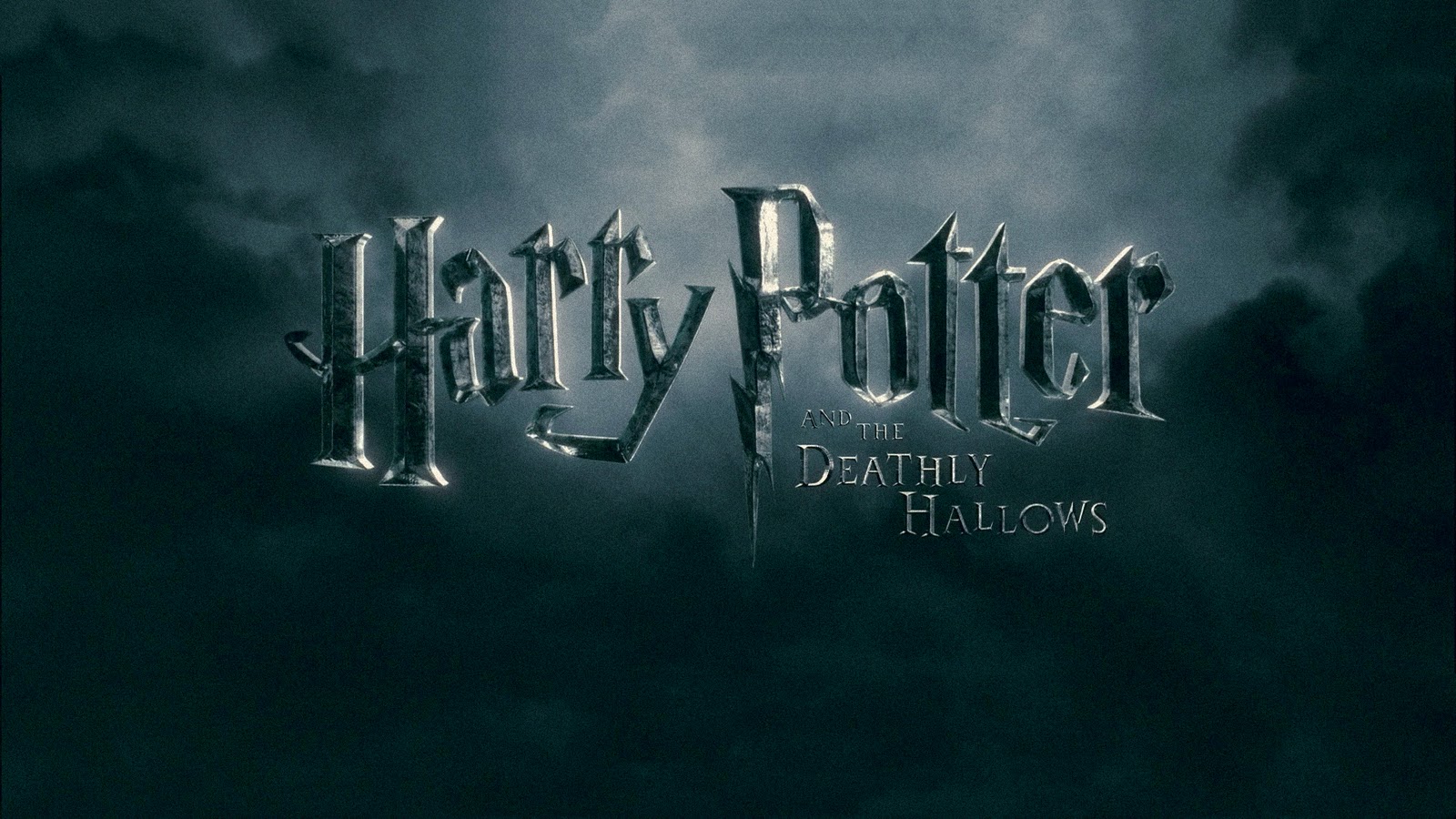
which looks like it would be in an old hand-written book which reflects the theme of the film
which is magic and mystery. The font is a dark, old looking silver and the background is dark clouds, much like you would see when it's raining which will make the audience think that there is going to be a lot more serious and evil parts to this film compared to the traditional Harry Potter title which is gold. The P in the title is shaped the same as the scar on
Harry's forehead which is a major plot element in the film, linking the title with the film. The detailed and unique title makes it very recognizable which makes for a
great marketing tool which helps promote and sell the film.
Harry's forehead which is a major plot element in the film, linking the title with the film. The detailed and unique title makes it very recognizable which makes for a
great marketing tool which helps promote and sell the film.
The Bourne Legacy is an action packed spy film.
 The titles of this film are in plain white block text, with each word being in a different level of boldness which makes it stand out more and gives it a sense of being more sophisticated. It is quite conventional of an action film to have plain white text. The black background of the title makes it stand out more. My group are doing an action film quite similar to The Bourne Legacy and we are probably going to use the same type of font as we want our film to seem as professional as possible.
No comments:
Post a Comment